Did You Notice: New Logo
It’s actually not a new logo, it’s still our beloved sword and shield logo, but we’ve made some subtle changes. Partly due to how our branding shows up on websites, shirts, patches, etc, and partly it makes it stand out nicer. So the main obvious difference is the border of the shield. Previously, the border of the shield was thin and roughly the same width of blades on the weapon. Especially on shirts and embroidered pieces, the imagery seemed to fall a little flat. This becomes very obvious when the red and blue colors aren’t used and only the outline of the shield and swords are used.
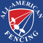
Also, the blades were uneven The didn’t have the same bend, the blades all taper but each blade had different widths. Although in reality the three weapons do have different blade size, but for iconography we wanted them to be similar. Lastly, the when the title appears with the logo, we used a very familiar, but overused Times New Roman font.
Yes, we realize the foil guard appears to be larger than the saber and epee guard, but we felt if we changed it now, it would stray from the original design a little too much.
So what’s new in the new logo?
We began to mention that the border of the shield is much thicker. It stands out better and feels very solid. We’ve evened out the blades, although each of the have a very slightly different bend, they all have an equal width throughout the blade, no more taper; again, the thicker blades help the logo stand out nicer.
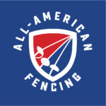
Lastly, we finally found a font that we like. The official All-American Fencing Academy font is the Sucrose font, designed by Ryan Martinson of the Yellow Design Studio. We have been looking for a font that had an Americana feel, we even thought to have a military feel because of our close ties with Fort Bragg and the Military, but we didn’t want to use the overused Stencil font. Other Americana type fonts utilized cursive which didn’t fit will with our design. The Sucrose font family evoked a retro/legacy Americana feel you would see in ads and shop signs.
The Sucrose Bold is mainly used with branding, however, you will also find Sucrose being utilized throughout the website, but a distressed version is used to give the website a subtle retro/legacy Americana feel.

If you’d like to learn more about the All-American Fencing Academy’s branding like the official colors, the AAFA fencers, our sonic branding, and slogan, visit our Branding Guidelines page.


